
Sea Surface Temperature

From 1940 to 2025, sea surface temperature compared to the 1991-2020 average. Blue, cooler. Red, warmer. One frame per year.
The map is a Spilhaus projection: it cuts the planet through the continents instead of through the ocean, so you see in one piece what we always treat as four separate oceans. It's one.

A follow-up to the annual version of this animation (ERA5, 1940-2025): same reanalysis, same 1991-2020 baseline, but this time month by month instead of year by year, and starting in 1982 instead of 1940 to keep the frame count manageable. Going monthly changes what the animation shows. The annual version told the story of the long-term trend, decades slowly shifting from blue to red.

Ocean temperature doesn't just respond to a warming atmosphere, it also stores the overwhelming majority of the extra heat trapped by greenhouse gases, over 90% of it. This animation shows the linear trend in sea surface temperature (ERA5 reanalysis, 1940-2025, 86 years of data) across the globe, in K/decade. Land is shown in flat gray; the trend is oceanic only.
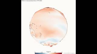
Since the 1980s, satellites and reanalysis models have let scientists track how surface temperature is changing, not just on average, but region by region. This animation shows the linear trend in 2-metre air temperature (ERA5 reanalysis, 1979-2025) across the globe, in K/decade.

We know, we live in a changing world. How temperature is evolving is just a measure for that change and how we might be feeling it.
Here we have 61 years of changing global temperatures (Data exported from ERA5).
Data: ERA5
Ocean color

🌊🌱 28 years of a living ocean, month by month
This is ocean surface chlorophyll from September 1997 to December 2025, seen from space. Chlorophyll is the pigment of phytoplankton: microscopic algae responsible for roughly half of the photosynthesis on the planet and the base of almost all marine life.
What to look for:

This globe shows the mean surface chlorophyll-a from 1997 to 2025, measured by satellites. Chlorophyll tracks phytoplankton, the microscopic algae that carry out roughly half of the photosynthesis on Earth.
Sea Level

Since 1993, satellite altimetry has measured the height of the ocean surface with millimeter precision. This animation shows the monthly sea level anomaly (Copernicus/CMEMS, vDT2024) from 1993 to 2025, projected onto the Spilhaus projection, which shows the world ocean as a single connected body of water instead of cutting it into pieces at the map edges.

Since 1993, satellites have been measuring the height of the ocean surface to millimeter precision, tracking one of the clearest fingerprints of a warming planet: global sea level rise.
Sea Surface Salinity
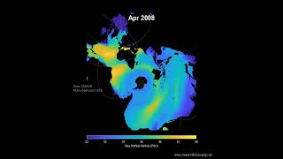
Since 1993, oceanographers have tracked sea surface salinity from space and ships alike. This animation shows the monthly global distribution (CMEMS multi-observation product) on the Spilhaus projection, in PSU (practical salinity units), the actual field, not an anomaly, because the structure itself is the story here.
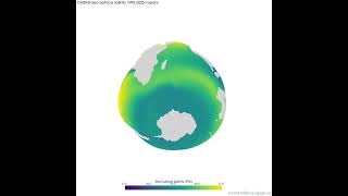
A companion piece to the recent Spilhaus animation of monthly salinity: this globe shows the 1993-2025 mean sea surface salinity (CMEMS multi-observation), in PSU. Land is grey.
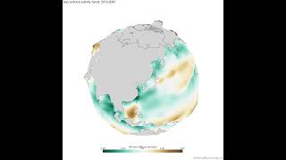
🧂 The ocean is a rain gauge
There are no rain gauges in the middle of the Pacific. But every drop that evaporates leaves its salt behind, and every drop of rain dilutes what is already there, so the ocean keeps its own record of the water cycle written in salinity.
Ocean Dynamics
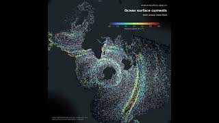
🌊 The ocean's surface, as it flowed through 2025
Every trace is a virtual particle carried by the mean surface current of 2025. The colour and the length of the trail both show speed: long and red means fast, short and blue means slow.

🌍 The ocean's horsepower, mapped
This globe shows the mean kinetic energy of the ocean surface in 2025: how much energy the average current carries at each point. It is the same field as our particle animation, seen as a landscape instead of as flow. Where the water moves fast, the surface bulges outward; where it barely moves, it stays flat.
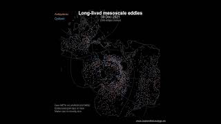
🌀 The ocean’s weather, three and a half years of it
Every dot is a mesoscale eddy: a rotating body of water tens to hundreds of kilometres across, tracked by satellite altimetry from the dip or bulge it makes in the sea surface. Only eddies that survived at least 90 days are shown, and even so there are more than two thousand alive on any given day.

⚡ The other half of the ocean’s energy
This globe maps the kinetic energy carried by ocean eddies: not the average current, but the swirls that form around it. Every mesoscale eddy detected by satellite altimetry between 1993 and 2023 contributes, and where that energy is high the surface bulges outward.
Air-Sea Heat Flux

Ocean and atmosphere trade heat constantly, and this animation shows just how much that exchange follows the sun. It's the monthly net heat flux at the ocean surface (ORAS5 reanalysis, 1979-2025), in W/m². Red means the ocean is gaining heat from the atmosphere; blue means it's giving heat back.
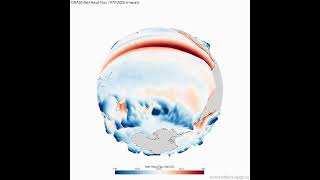
The ocean and atmosphere are constantly trading heat, and that exchange isn't random, it's structured by currents, wind patterns, and geography. This animation shows the 1979-2025 mean net heat flux at the ocean surface (ORAS5 reanalysis), in W/m². Red means the ocean is gaining heat from the atmosphere; blue means it's losing heat to it. Land is shown in flat gray.
Sea Ice
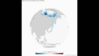
Since 1979, ERA5 reanalysis has tracked sea ice cover across both poles, one of the most visible fingerprints of a changing climate. This animation shows the linear trend in annual mean sea ice concentration (%/decade). Land is grey; the vast majority of the ocean, which has never had sea ice and never will, is left pale and blank on purpose.
Tidal Dynamics

At any one place the tide rises and falls twice a day. Seen globally, it does something else: it rotates. This is M2, the lunar semidiurnal constituent, the largest contributor to the tide almost everywhere. One cycle takes 12 h 25 min, which is why high tide arrives about fifty minutes later each day.

🌊 Where the tide is, and where it isn't. This globe shows the tidal range of M2, the lunar semidiurnal constituent and the largest contributor to the tide almost everywhere. Not the tide at any particular moment, but how far the sea can move at each point: the difference between high and low water.
Data stories

Every station in the World Ocean Database that sampled to at least 100 m depth, flashing at its exact place and time. From HMS Challenger through isolated national expeditions, to the transoceanic collaboration of the postwar decades, to Argo's drifting floats.

Since the 1980s, growing concern over greenhouse gases pushed scientists to start breaking down exactly which human activities were driving emissions, sector by sector: Energy, Agriculture, Industrial Processes, Waste, Land Use Change and Forestry, and international Bunker Fuels (aviation and shipping).

🤖 Nobody is driving this
Every flash is an autonomous float rising from two thousand metres, reporting what it measured on the way up, and sinking again. Ten days of the global Argo array, late September 2026.